
Pure fluidity meets ultimate performance: What Really Makes Business Software Fast
A warehouse manager doesn't recognize bad software by an architecture diagram. They recognize it by the fact that employees reach for the phone again, capture delivery notes twice, or can't say after a shift which goods actually arrived. Pure fluidity meets ultimate performance therefore mustn't be a merely visual aspiration. For business software, it means that a transaction feels natural and at the same time works reliably under real conditions.
…
A warehouse manager doesn't recognize bad software by an architecture diagram. They recognize it by the fact that employees reach for the phone again, capture delivery notes twice, or can't say after a shift which goods actually arrived. Pure fluidity meets ultimate performance therefore mustn't be a merely visual aspiration. For business software, it means that a transaction feels natural and at the same time works reliably under real conditions.
An elegant interface is worthless if it stutters on weak Wi-Fi in the warehouse. A fast application also helps little if it forces a sequence of work that nobody at the ramp can follow. Good digital tools combine design, speed, and process understanding. They reduce friction without pressing the business into a prefabricated standard logic.
Pure fluidity meets ultimate performance is an operational question
Fluidity is often confused with animations, large images, and smooth transitions. That may suit a modern brand. In daily work, though, it shows up differently: a goods receipt can be booked without detours. An employee finds an order even when only a reference number is known. An error is named clearly instead of vanishing into a cryptic message.
Performance is likewise more than a good score in a browser test. What matters is the response time for an order with many items, stability at month-end, and the question of whether five people can work at the same time without overwriting each other's data states. A clean way of handling dropped connections, permissions, and locked accounts is part of it, too.
The two are inseparable. If a screen responds instantly but has unclear mandatory fields, it stays tiring. If the workflow is cleverly modeled but the page waits two seconds on every booking, it gets bypassed. Fluidity arises where the system supports the next sensible action and stays technically fast enough that the train of thought doesn't break.
The interface follows the work path, not the org chart
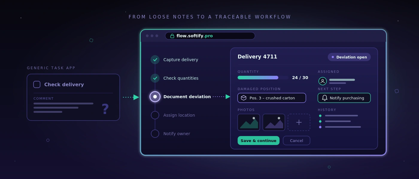
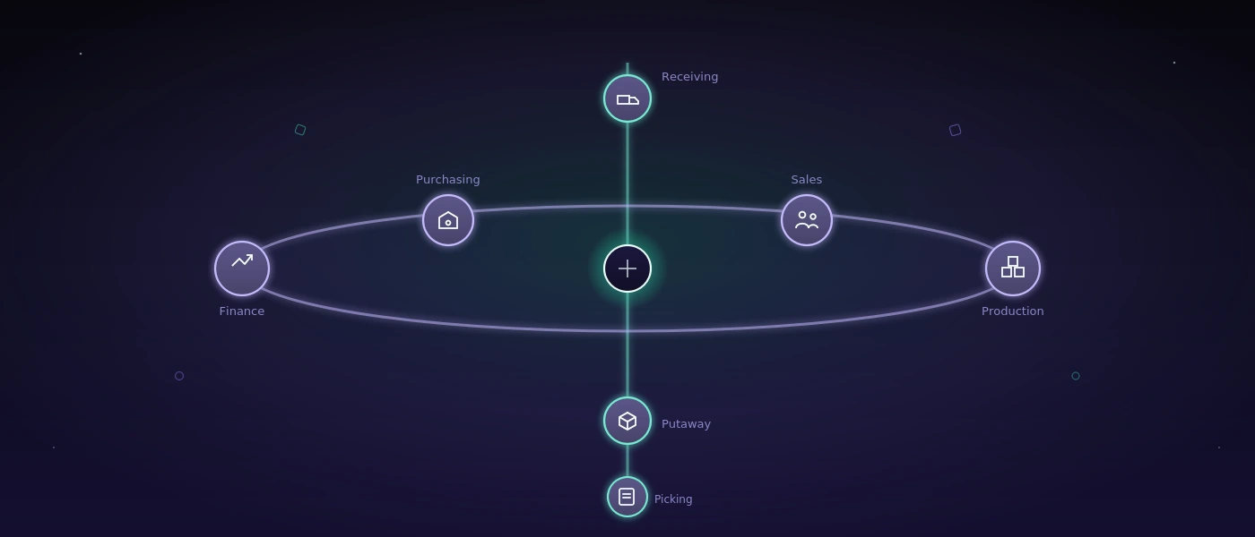
Many standard solutions structure their menus by modules: purchasing, sales, warehouse, reporting, administration. That's understandable from a product perspective. On the warehouse floor, however, work often begins with a situation: a truck is waiting, a pallet is missing, a customer needs proof of delivery, or a shipment still has to be labeled before the cut-off time.
A good custom application therefore starts with these situations. What information is available? Who decides? What has to be documented? What mustn't be changed later? Only after that is it decided which input screen, check, or automation is required.
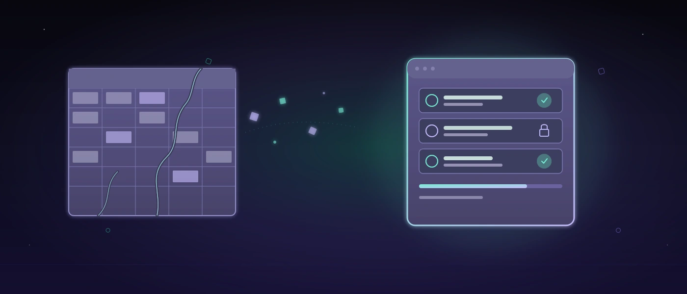
That doesn't mean casting every existing workflow unchanged into software. Some spreadsheets really are too error-prone, some approvals unnecessarily slow. But a working Excel list doesn't necessarily have to be replaced by a project. If it's maintained by only one person, knows few exceptions, and remains traceable, it can be the right tool. Software pays off when it improves coordination, reduces sources of error, or makes information reliably available to several participants.
Fewer clicks aren't automatically better
The demand for as few clicks as possible sounds reasonable but can lead in the wrong direction. For an irreversible warehouse booking, a short confirmation makes sense. For a shipping release, a visible plausibility check can prevent expensive rework. The right workflow depends on the risk.
What matters is that additional steps have a clear purpose. A confirmation shouldn't appear just because the framework generates it easily. It should stand exactly where people have to make a decision consciously. That way the application stays fast without becoming careless.
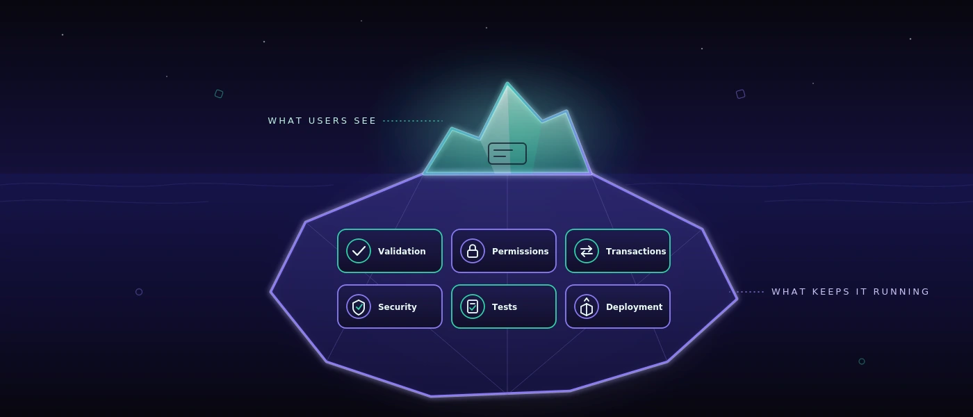
Performance arises in the architecture, not in the last sprint
Anyone who speeds up a website or web application only shortly before go-live is usually treating symptoms. Large queries, unclear data models, and special cases added afterwards can't be permanently corrected by a single optimization day.
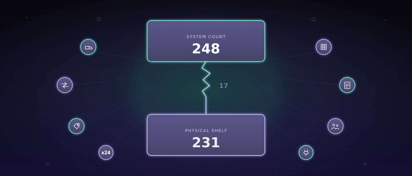
A robust foundation begins with a database that matches the actual relationships in the business. In MySQL 8, movements, documents, status changes, and user actions need traceable keys and sensible indexes. A stock level mustn't appear merely as a number if it later has to be clarified which booking it resulted from. At the same time, not every piece of historical information has to be recalculated on every page load.
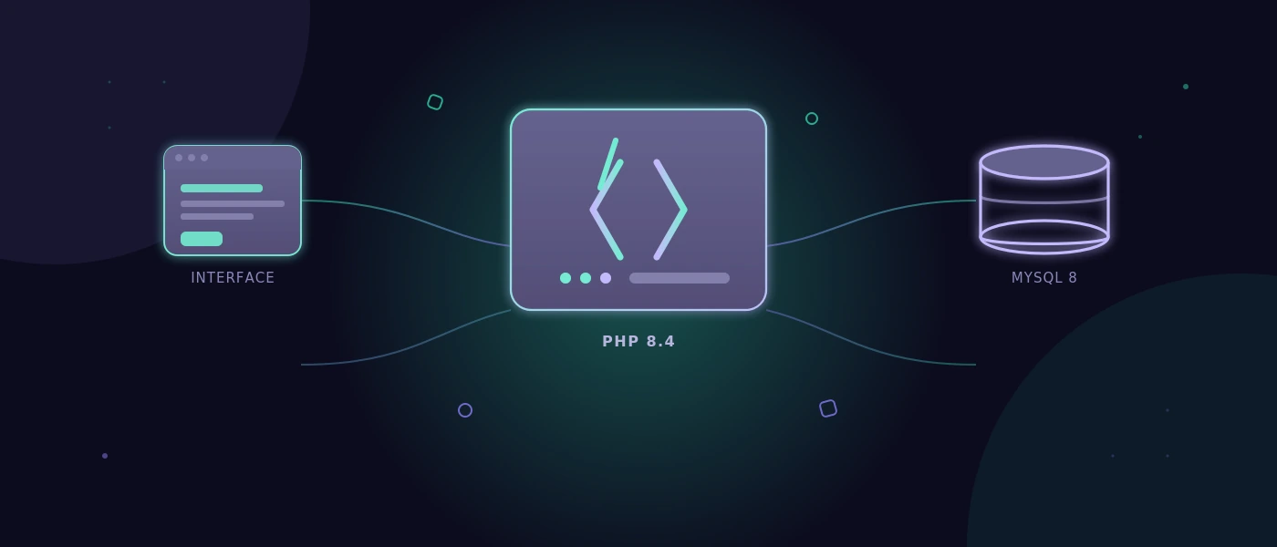
With modern web applications, the separation of responsibilities is also relevant. PHP 8.4 can represent business rules clearly and maintainably, while modern JavaScript is used selectively for reactive areas. That's not a creed for a particular stack. It's a question of maintenance: can changes be implemented safely in six months? Is it visible where a rule applies? Can an error be reproduced instead of merely guessed at?
Performance also needs limits. Search fields need sensible minimum characters or precise filter logic if millions of records are conceivable. Large lists need pages or graduated loading processes. Images and documents shouldn't block the critical workflow. These decisions seem unspectacular. That's exactly why they often stay valuable longer than a conspicuous frontend effect.
Visible speed creates trust
Not every process can finish in under a second. A label print, an interface to the shipping provider, or a check against external data occasionally takes time. What matters then is how the application handles waiting.
A clear status such as “Shipping label is being created” is better than a frozen button. After completion, it should be recognizable which number was generated and whether the transaction may be triggered again. If an external service is unreachable, the team needs an understandable course of action instead of an error message for developers.
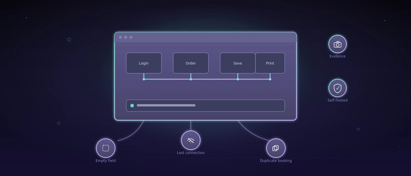
That's also a question of data integrity. A double click mustn't create two deliveries. An aborted process mustn't silently leave behind a half-finished record. Good systems plan for such cases because they will occur in daily work. Especially with changing shifts, time pressure, and mobile devices, the exception isn't a fringe topic.
Quality becomes visible before the error
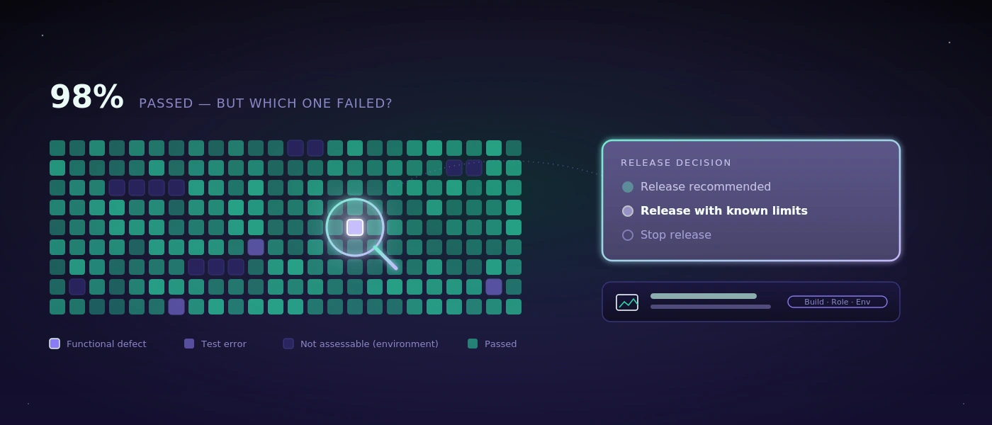
For applications with many process variants, it isn't enough to click through a few paths manually at the end. Changes to prices, roles, validations, or interfaces can trigger consequences at a distant spot. Here automated testing becomes part of performance: not only technically, but organizationally.
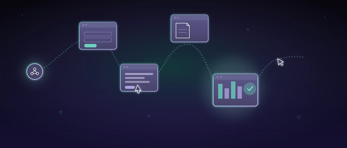
A test system should be able to check real workflows, such as creating an order, changing an item, generating a delivery note, and verifying permissions. It should record evidence and phrase results so that business departments can interpret them. A sentence like “The shipping process wasn't completed after the address change” helps more than an uncommented stack trace.
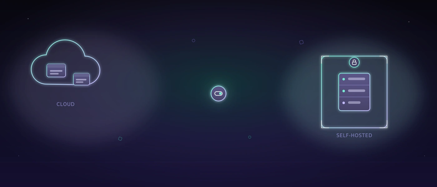
For security-conscious teams, the place where these tests run is also relevant. If screenshots, credentials, test cases, or internal application steps shouldn't leave the company, a self-hosted approach is often more sensible than an external cloud service. With COCO, automated tests for web and Windows applications can be run on a dedicated environment. That isn't necessary for every team. For sensitive data, regulated areas, or internal business applications, though, control over test data can be a decisive advantage.
Design is good when it makes work easier
A strong visual identity can create trust. It shows that a company takes its digital presence seriously. In an operational system, however, design has to do even more: orientation under time pressure. Contrast, typography, clear states, and understandable labels decide whether someone completes a transaction confidently or asks a colleague.
Restraint is often the better choice here. A dashboard with ten colorful metrics can look impressive and still hide the single relevant deviation. A reduced view that makes open goods receipts, missing scans, and at-risk delivery dates visible is more useful. The question isn't how much interface is possible, but which information improves a decision.
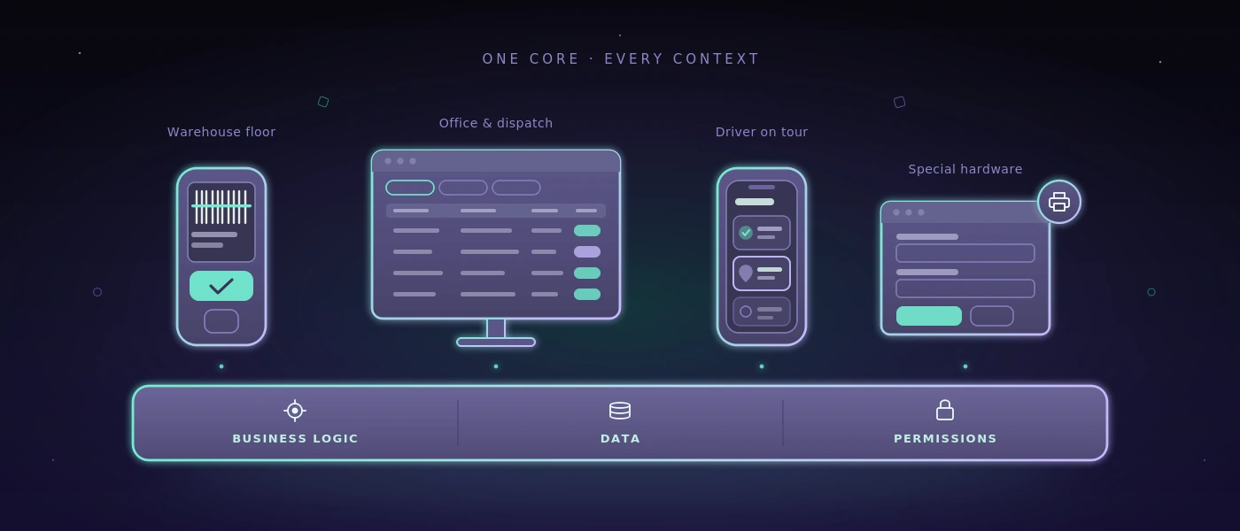
That also applies to responsive applications. Mobile capability doesn't mean squeezing every desktop screen into a smaller format. A smartphone at goods receiving may need only scan, quantity, storage location, and confirmation. Detailed follow-up work possibly belongs on a larger screen. Different devices deserve different priorities, even though they access the same reliable data foundation.
A sensible yardstick for the next decision
Before a team decides on a new platform, an automation, or a complete rebuild, a simple check helps: does the workflow become clearer, faster, or safer for the people who perform it daily? And can the solution still be understood when requirements, staff, or interfaces change?
If both answers are robust, a nice promise becomes a usable system. Then pure fluidity meets ultimate performance shows itself not on a slide, but on a calm working day on which orders, data, and decisions keep moving without unnecessary friction.